| By | Casey Muratori |
The Ugly Cabinet Stairs
“Wait, what the hell is a blue noise pattern?”
To be fair, that may not be the precise quote. It’s entirely possible that I used a different expletive. It’s been about a decade since I said it, so you’ll have to cut me some slack.
It was the spring of 2005, and I was sitting in Don Mitchell’s study. We were looking at this image on his computer’s monitor:
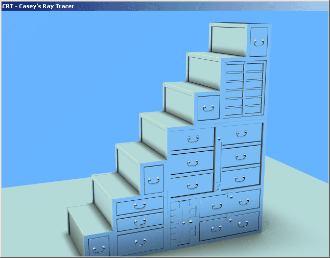
That’s a raytraced image of a Japanese cabinet stairway. I’d modeled it in 3DSMAX, and I’d written an exporter and a raytracer so that I could play around with doing some photorealistic rendering code. Once I’d gotten all the basics working, it was time to sweat the details, but I really didn’t know very much about how to do realistic lighting calculations. They’re not all that complicated at the end of the day, but if you don’t have a firm grasp on the subject, you can easily omit a crucial term or combine things in the wrong way that will leave your image looking not quite right, but you’ll have no idea why.
One option was to start wading through books and papers and eventually come up to speed on everything I needed to know to get the lighting right. But realistically, going that route, it might take several days before I even gleaned what was important to study and what wasn’t. The body of literature on the subject is rather massive.
The other option was to accelerate the process by asking an expert to clue me in ahead of time, so that I’d know what to focus on and what to skip. That requires knowing an expert, but luckily for me, I did: Don Mitchell.
I’d known Don for many years — we’d met through mutual friends at Microsoft — and I knew he had done a lot of seminal raytracing research. I sent an e-mail to him asking if he’d be up for teaching an impromtu “Intro to Physically-Based Lighting” course, and attached the image of the cabinet stairs. Perhaps sensing how dire the situation was given the poor lighting in the image, he agreed, and the next day I drove to the outskirts of Redmond to meet him at his house.
Over the course of about two hours, Don taught me the right way to think about lighting, and I felt pretty confident that I could go back and start coding something reasonable. But as we were wrapping up, I remembered one other thing I wanted to ask him about: how to properly deal with edge aliasing artifacts.
If you look closely at those cabinet stairs, you will notice how ugly the sharp edges look:
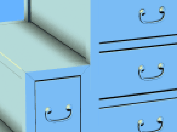
I suspected the majority of the ugliness came from how I was sampling the image — how my raytracer chose which sub-pixel locations it would cast rays through. If you’re familiar with modern GPUs, you know that they often sport antialiasing technologies specifically designed to eliminate ugly edges like these. But those are for real-time applications, and raytracers have the luxury of being off-line, so I wanted to know what sorts of schemes you’d use if you have the computing resources necessary to do whatever you want.
So I asked Don, “What kind of sub-pixel sampling pattern should I use?”
He replied, “Well, the best thing would be a blue noise pattern.”
As you can infer from the quote at the beginning of this section, that was the first time I’d ever heard that term.
White Noise, Red Noise, Green Noise, Blue Noise
Now, here is the part where I have to apologize that it’s me writing the article and not Don. Image sampling analysis, power spectra, periodograms — these sorts of things are not my specialty, because fundamentally, I’ve never been a rendering guy. I’m more of an animation and systems guy. So while I would love to give you a great explanation of noise at its most fundamental level, you’re just going to have to take my word that you really don’t want me to do that, because it would probably be either too confusing or partially wrong. Or both.
What I can do is give you the high-level overview: the reason those edges looked so ugly was because they were sampled regularly. For each pixel of the image, I was subdividing the space it covered into a regular 4x4 grid. I used the raytracer to determine what the colors of those 16 points were, then averaged them together to get the final color for the pixel.
Using lots of samples for each pixel guarantees that you get a nice smooth image. It computes plenty of information about the scene behind that pixel, so it doesn’t produce errant results like you would get if you just did one raytrace per pixel. If you just did one, that ray might just happen to hit some small feature in the scene, and because it’s the only sample you took for that pixel, the whole pixel becomes the color of that very small feature. By using lots of samples and taking the average, you’re guaranteed not to have this problem.
But, you quickly run into a different kind of problem when you use regular sampling. Because all the pixels are subsampled from identical 4x4 sub-grids, any edge that passes through multiple pixels will smoothly drop its contribution as it passes from one pixel to the next. Across a whole row of pixels, an off-angle edge will result in a constant amount of color change from pixel to pixel as it covers less and less of the 4x4 grid in each pixel.
It is precisely this effect that looks so objectionable in my cabinet stairs rendering.
As counterintuitive as it may seem, the way you fix this is by using an irregular sampling pattern. Instead of a nicely repetitive grid, you actually pick a scattered set of points inside each pixel, where no two neighboring pixels use the same set. This actually introduces noise into the image, breaking up the smoothness, and although we normally think of noise as undesirable, in this case it’s actually what we need to prevent the eye from being drawn to the regularly changing pattern produced by regular sampling.
So, the natural question would then be, how do you produce these scattered point patterns? Well, most people actually did this in a very ad hoc fashion at first. And to be fair, any randomized pattern will probably work to some extent. But according to people like Don who’ve studied the matter extensively, if you really want the highest quality possible, you want to use a very specific kind of pattern.
The pattern comes originally from an observation — and I swear I’m not making this up, this is what you will find if you read the early papers — that the light-sensitive cells in our eyes are actually arranged in a pattern that is irregular, meaning it does not have any clear orderly structure to it like a grid, but also low frequency, meaning that there are never any tight clusters of cells, they are always somewhat evenly spaced. Researchers hypothesized that this pattern might account for why the human visual system is so good at avoiding the kind of regular sampling artifacts that I had in my raytracer, and this lead them to try employing such a pattern for image synthesis.
And here is where the strange name “blue noise” comes in. As it appears in the visible spectrum, blue, as compared to green or red, is in the highest frequency part of the spectrum. So blue noise refers to the fact that the pattern has high frequency noise, but no low frequency noise. It’s a type of pattern now familiar to graphics researchers everywhere and which is employed for all sorts of purposes.
By extension, you can probably figure out why “white noise” is “white”: it’s the kind of noise that has all frequencies in equal parts. So while a blue noise pattern looks like random points spaced consistently, a white noise pattern looks like purely random points, complete with big clumps and wide open gaps. No consistent spacing. Here’s a comparison of the two — both images have the same number of points:
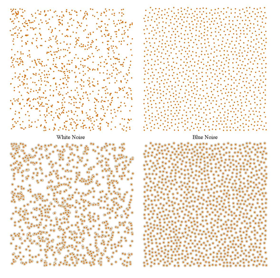
(I should state, parenthetically, that none of the images in this article, including these, are actually real noise, because I am using a standard, simple random number generator like the kind you would generally get if you used a common standard library. Real noise has certain requirements of the random series on which it is based, and most standard libraries don’t meet those requirements. More on that next week. Now back to the topic at hand…)
All the other colors have their own kind of noise as well. Red noise is the opposite of blue noise: it has only low frequency noise but no high frequency. Green noise has middle frequency noise but no high or low. In fact, people have actually made spatial pattern generators that allow you to input the frequency profile that you want, and get the corresponding point pattern out. It’s really quite neat, and I highly recommend reading this paper so you can see some other possible noise parameters, like anisotropy.
Amusingly enough, after learning about blue noise from Don, I never actually implemented it in an image synthesis scheme. I never bothered to do it in my raytracer, and I’ve never done any other image sampling work, so I never had the occasion. But I have used it in just about everything else.
Not being a rendering guy, it was hard for me to get excited about the nitty gritty of image sampling. It’s just not something I spend a lot of time working on. But once I saw the blue noise patterns, I immediately realized that I had been doing a lousy job on all the procedural placement code I’d ever done. I’d even written grass placement code prior to that talk with Don, and I just used white noise, and it never occurred to me that I might want to stop and think about the kind of random distribution I was using, and whether that distribution properly modeled the kinds of distributions in the actual physical phenomenon I was trying to simulate.
In the years between talking to Don and working on The Witness, I’d written several pieces of code that used blue noise, so I was well versed in the do’s and don’ts. Really, I owe a big thanks to Don for the fact that I was at all prepared for dealing with the oddities of the grass planting system.
Which brings me back to where we were last week.
White Minus Yellow Makes Blue
If you read last week’s post, you know that we left off with me looking at this image:
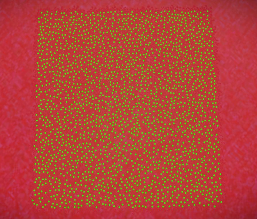
Thanks to having had plenty of experience with blue noise, I actually knew roughly what I was looking at even before touching the code. After seeing the comparison between blue noise and white noise in the previous section, I suspect you already know what kind of pattern you’re looking at, too: blue noise.
So I knew the code in The Witness’s grass planting system was at least nominally trying to produce blue noise, but it was having trouble with errant gaps. It was time to take a closer look at the specific choice of blue noise generation algorithm. Only a few minutes into reading the code I could see it was using a very standard method: just start with white noise, and throw out points that aren’t blue.
That may sound ridiculously abstract, but it’s actually simple in practice. If you think about it, the primary characteristic of a blue noise pattern is that points remain evenly spaced despite being random. If we just picked purely random points, we’d get white noise, which is distinct from blue noise in that it has clumps and gaps. But what if we just take the white noise and remove points that are too close together? That would take care of the clumps, and we’d just be left with the problem of gaps. But if we just generated enough white noise, it would be dense enough that there wouldn’t be any gaps larger than the size we actually want to keep our point evenly spaced.
That leads directly to the standard algorithm for generating blue noise. It’s often called Poisson disk sampling, and although I’ll spare you the details, I believe it’s actually a misnomer since, although there are disks involved, almost nobody actually guarantees they have a Poisson distribution. So while there is such a thing as an actual Poisson disk sampling, most of the time people are actually just doing a pseudo Poisson disk sampling, you might say.
But ignoring the misapplied name, the algorithm is very simple. Pick a minimum spacing for your points. Start adding random points. Every time you go to add a new point, if it’s less than the minimum spacing from some other point, reject it. Otherwise, keep it. Run the algorithm for long enough to fill in the space, and you’ve got your blue noise pattern.
That’s the entire algorithm, and it works reasonably well. It’s what The Witness was using. But there are two fundamental problems with this algorithm, one computational and one theoretical. The computational one is straightforward, and accounts for the larger of the remaining gaps in the distributions. The theoretical one is much subtler, and I’ll save it for next week when we’re ready to start getting a little more badass.
OK, so I just stated, quite literally, the entirety of this algorithm: pick random points, throw out ones that are too close to any existing point. When the algorithm first starts running, this poses no computational problem, because most of the points you randomly pick will not be close to anything at all, since most of the space is empty. But, as the space fills up, more and more of the random points you pick will land too close to existing points, and have to be thrown out.
To illustrate this, here are some snapshots of the algorithm at work. Valid points are shown in orange, whereas points that had to be thrown out are marked in blue. Here we see the difference between going from 100 points to 200 points and going from 1000 points to 1100 points:
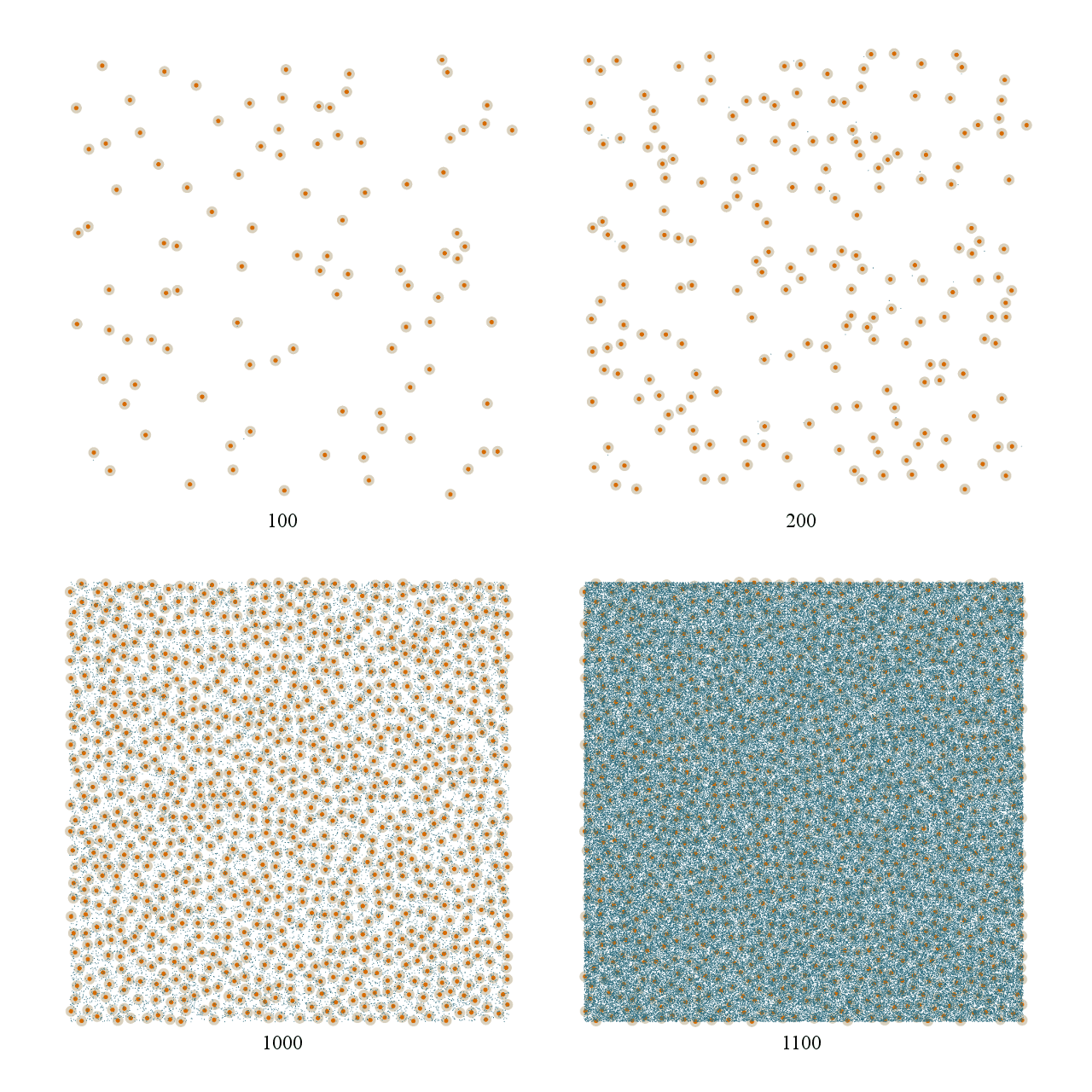
See what I mean? The number of rejected samples in the 100 to 200 case is miniscule. You barely even notice there are any blue marks at all. But in the 1000 to 1100 case, the increase is massive. Both cases add 100 points, but the difference in work necessary to do so is dramatic.
What’s happening here is very logical when you think about it: you are trying to fill up this entire space with points. At first, anywhere you pick will be empty. But as you add more points, the places where it’s valid to put them shrinks and shrinks. Because you are always picking random points across the entire space, as the algorithm progresses it becomes less and less likely that a random point will land somewhere valid.
And this is where the gaps come from. Eventually, the algorithm fills the space with points until there are only few extremely tiny regions of space where a new point could fit. The algorithm must pick a massive number of random points before it gets lucky and lands in one of those tiny regions. This leads to an extremely nasty computational cost curve that looks like this:
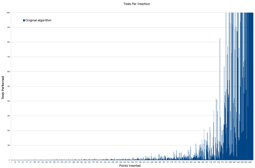
That is the number of random points the algorithm has to go through for each new point it adds successfully. The computational problem is pretty hard to miss. And that’s cropped so that you can see detail in the run-up. Here’s the full scale version:
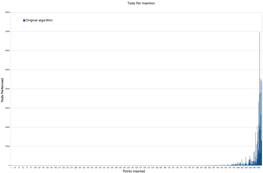
Not good. Not good at all. Basically what this says is that if you don’t run the algorithm for an extremely large number of random samples, you are likely to end up with gaps that the algorithm just never randomly got the chance to fill. There won’t be many of them, but there’ll be a few, and that’s exactly what we’re seeing.
In The Witness’s grass planting system, this situation was actually worse than I’m making it sound, because there’s an additional factor at play in a game world that doesn’t apply if you’re just generating point patterns in an abstract space.
The problem is that The Witness’s grass planting code was written in such a fashion as to pick the actual 3D position of grass points before checking whether or not they were valid for the distribution. This makes some sense if you are trying to cover very steep or uneven terrain, because you may want to allow things to be closer together laterally when they are further apart vertically (although it is unclear that this works well with grass rendering, but that’s a separate issue — it would certainly be a reasonable idea with scattered objects like rocks, which the system also was used to place). But it means you pay a large computation cost per random point, not just per point that you actually keep, because every random point you pick has to first be raycast against the world to find out where the ground is underneath it and so on. So as the number of random points per accepted point skyrockets as per the graph, the computational cost required to find each new point becomes massive, since each one is expensive and you’re doing a ton of them. Nobody’s going to want to run the grass planter for that long, so you’re basically guaranteed to have gaps.
Alright. I know it sounds bad, but we can handle this, we’re all professionals here. OK, technically I was not a professional on this project, because I was volunteering, and the definition of a professional is that they get paid for their work. But let’s ignore that for right now and remind ourselves that we could be professionals. And not only are we could-be professionals, but we’re could-be professionals who have already determined one clear-cut source of gaps in the grass planting algorithm. How do we go about eliminating it?
That last question was not rhetorical. I am literally asking you how to go about eliminating the source of gaps I just described, because I fully expect you to know the answer.
Although this may not seem like a huge problem, it is actually critical. The entire goal of an algorithm like this is to concentrate the samples in the areas where they are most likely to yield productive results. The more time you spend sampling and resampling wide open regions, the less time you spend mapping the actual edges of that region, which is the information you actually wanted. Because this is a continuous space and only an infinite number of samples can truly reveal its exact shape, your ratio of meaningful to meaningless samples is literally the measure of how effective your algorithm is at producing the walkable area.
Remember that? It’s from the very first Witness article I posted, the one about Walk Monster. If you recall, the problem with the earlier Walk Monster algorithms were that they weren’t concentrating their samples where the samples were most valuable. Fixing it so it concentrated the samples where they were valuable made a huge difference to the speed and quality of the results.
This is exactly the same kind of problem we’re facing here. We are picking random points across an entire space that we want to fill, but as the possible valid places in that space become smaller and smaller, we are not adjusting our sampling to account for it. To improve the situation dramatically, all we’d really have to do is figure out some way to stop looking for points in the areas we’ve already covered.
And really, didn’t Walk Monster already have a method for doing this? It was trying to produce a regular grid, but it employed a very simple concept for making sure it only concentrated on new areas: instead of sampling the space randomly, maintain a list of points you’ve already sampled, and only sample the neighborhood around those points. Once you’re satisfied that the neighborhood around a point no longer has any empty space, forget that point and move on to a new one. That way the sampling is always concentrated around points that we know lie on a sort of expanding front (commonly called a wavefront), where we forget about sampling in areas that we’ve already exhausted, and concentrate on new areas that haven’t been as completely covered.
This worked great for Walk Monster, and we can use the same technique here.
So, we pick one point at random, and start there. Then we test points around that point, adding as many as we can until we can’t find anymore. We then move on to testing the new points we added. And so on, and so on. Essentially, we are restricting the area where we look for new points to always be in the neighborhood of some existing point that we have not yet exhausted.
Thanks to the simple definition of Poisson disk sampling, this is actually quite easy to do. We already know there is a specified minimum radius, r, so we know that from any given point, we only have to look for points that are at least that far away. And similarly, we know that we don’t want to leave empty spaces where points could fit, so we don’t want to look more than twice that distance. This leaves us with a very straightforward method: pick a random angle, and a random distance between r and 2r. Go that far at that angle from the base point. Perform the standard test at this point to ensure that we aren’t too close to any other existing points. Repeat.
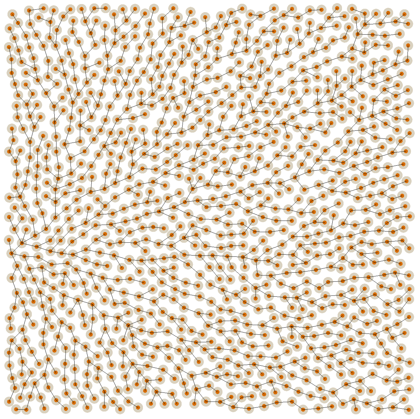
Much like with the original scheme, you “know when you’re done” sampling a point when you go some specified number of iterations without finding any new valid points. This number can usually be quite low, like 64, and still produce good results. Here’s an example distribution produced with this algorithm, along with a graph showing the neighbors from which each point was sampled:
We can see how much more efficient this algorithm is by comparing it with the original algorithm in terms of the number of samples taken. Here’s the samples-per-new-point graph again with the new algorithm for comparison:
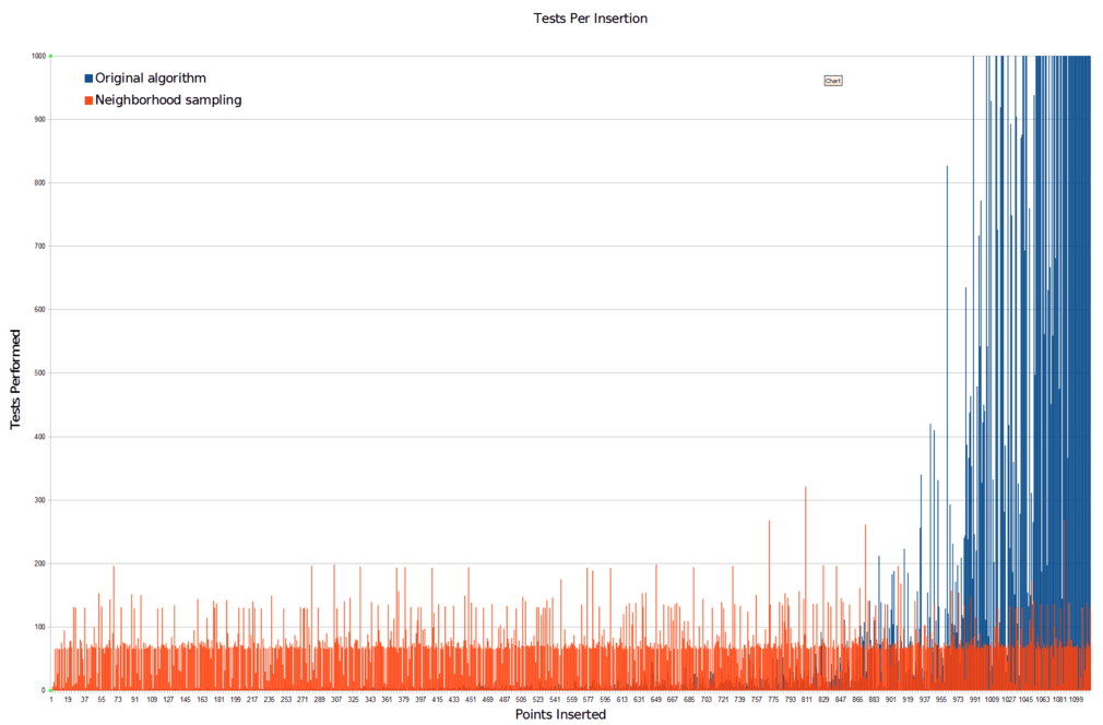
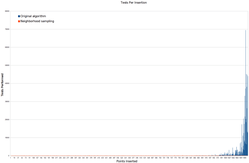
And here’s a plot of the unused samples of both algorithms when run to completion, so you can see their rejection distributions:
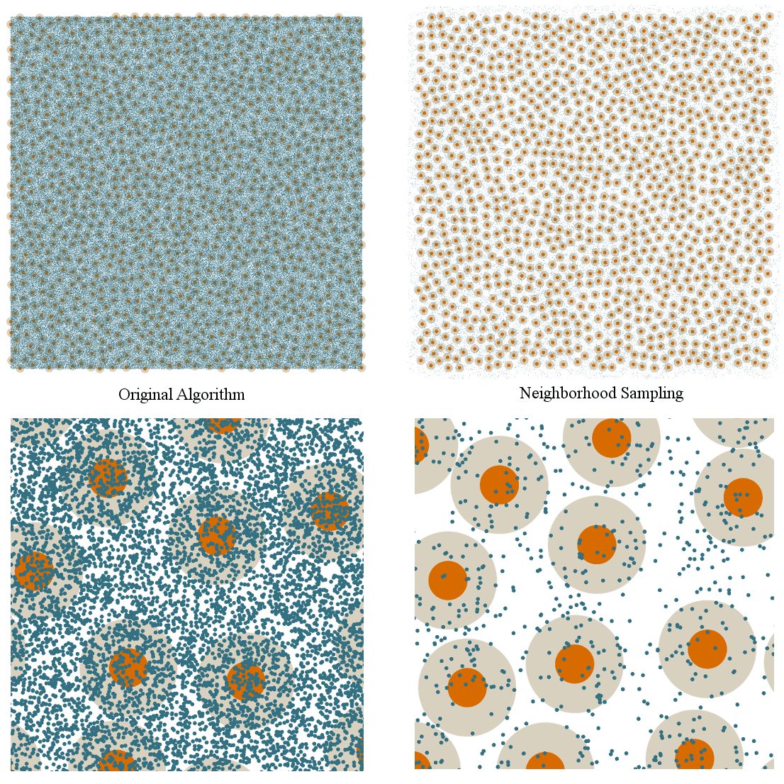
So, massive number of samples problem: solved.
This happens to be the simplest way I know of for solving this problem (you can read this technical sketch for more information), so it’s what I chose to do given that I knew it could be implemented trivially. Remember, my work on the grass planting system was done as part of the quick cleanup work for the Sony PS4 demo. But there are also a variety of more complicated algorithms you can employ, so if you’d like to learn some other options, I’d highly recommend checking out some papers like this or this.
The Theoretical Problem
Like a nimble ninja in the night, swiftly jumping from rooftop to rooftop, we have brandished the throwing star of directed sampling and deftly thrown it at the corrupt magistrate of inefficiency, where it lodged in his… I guess, head? Is it standard ninja practice to aim for the head?
To be honest, I don’t really know much about ninjas. They’ve never interested me. I feel like they probably assassinated magistrates at some point, because it seems like the sort of thing that a ninja would do. But in all honesty, if you asked me to define what a “magistrate” was for purposes of this discussion, even outside the analogy, I would probably have to say something like, “a majestic government official?” and my pitch would trend upwards at the end in uncertainty.
So let’s just agree that it’s not a well-researched analogy and move on. The point is that, yes, we may feel ninja-like, but what kind of ninja are we? Are we really the kind of badass ninja that jumps from rooftop to rooftop (in a coding sense), or are we a more flaccid kind of ninja, the sort of fellow who mostly just hangs out at fancy parties with other “ninjas” and accepts lots of silicon valley venture capital money for his ninja exploits, but really wouldn’t know one type of throwing star from the next (also in a coding sense)?
You already know the answer. I specifically said there were two problems with the original algorithm, one computational and one theoretical, and we have only addressed the computational one. So unless our primary goal is to sell our pre-profitability ninja headwear company to Facebook before anyone figures out that we don’t know what we’re doing, we’re going to have to put on our badass ninja gear and start taking to the rooftops for real. In a coding sense.
And that’s exactly what we’ll be doing on the next Witness Wednesday.